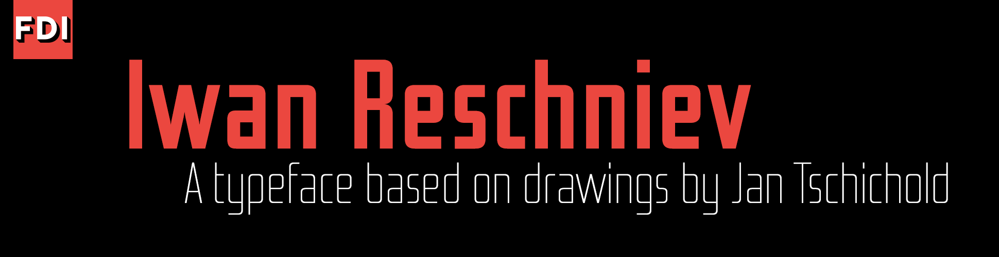
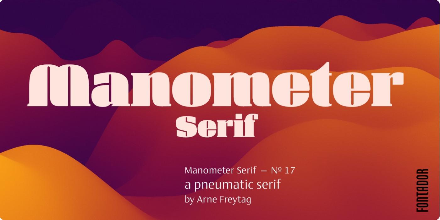
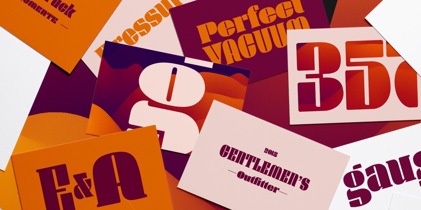
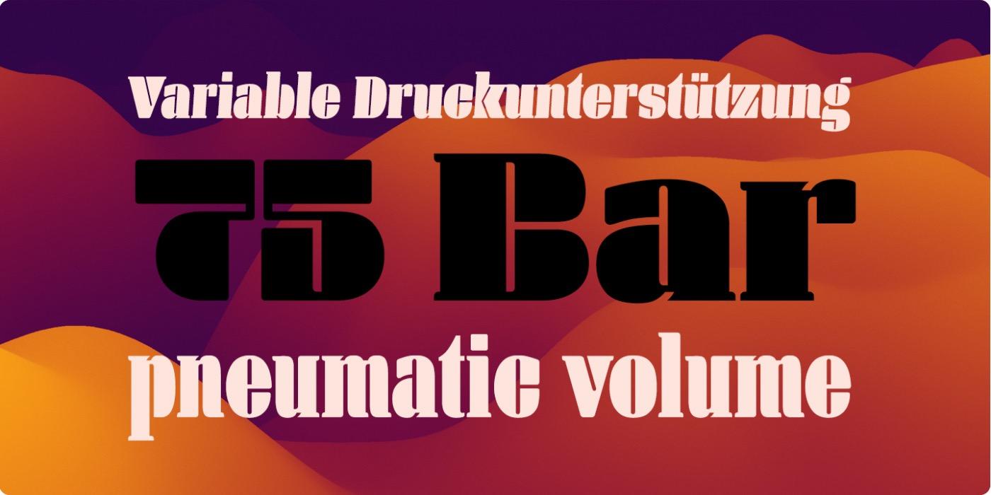
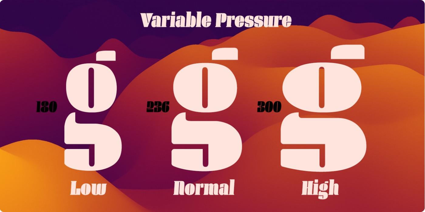
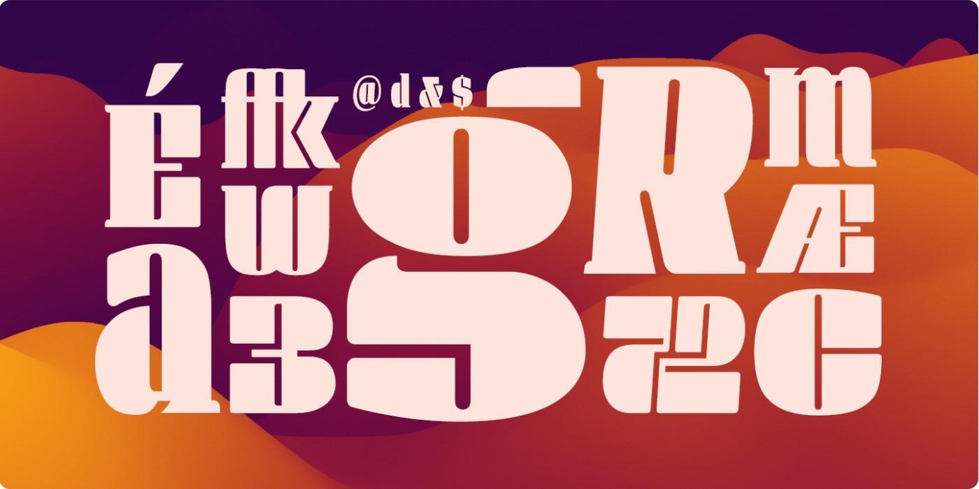
Manometer Serif ist eine ultra-fette Antiqua in sechs Schnitten oder als variabler Font.
Font-Wiki: Manometer Serif von Arne Freytag
Daten zur Schrift
![Arne Freytag Arne Freytag](https://www.typografie.info/3/uploads/81286020568753c224557b3fc37816eb.jpg)
Foundry: Fontador
erschienen: 2023
Vertrieb: Kommerziell
Art: serif
Formprinzip: Antiqua geometrisch
Versaleszett: Ja
Links für die Manometer Serif
![](https://www.typografie.info/3/uploads/monthly_2023_10/01.jpg.fd0a9123924eec648fe7fdd2a2b2b284.jpg)
![](https://www.typografie.info/3/uploads/monthly_2023_10/02.jpg.31a2cbc6a516e90f7a75b418e66a586c.jpg)
![](https://www.typografie.info/3/uploads/monthly_2023_10/03.jpg.aa4ec32edbc48f32edf502f7b733e670.jpg)
![](https://www.typografie.info/3/uploads/monthly_2023_10/04.jpg.4925073a8d70a7a03db18afec720d7f8.jpg)
![](https://www.typografie.info/3/uploads/monthly_2023_10/05.jpg.f3112157cde3bac5da0bbb674c32a6de.jpg)